Forum Cinemas – Website Redesign
Redesigning Lithuania's leading cinema website to create a smoother and more user-focused experience. This project was my final work at CodeAcademy course. All movie poster images were used from The Movie Database.
See the full presentation of this case study here or scroll down below to find out the key points about this project.
Contents
Project Overview
The Problem
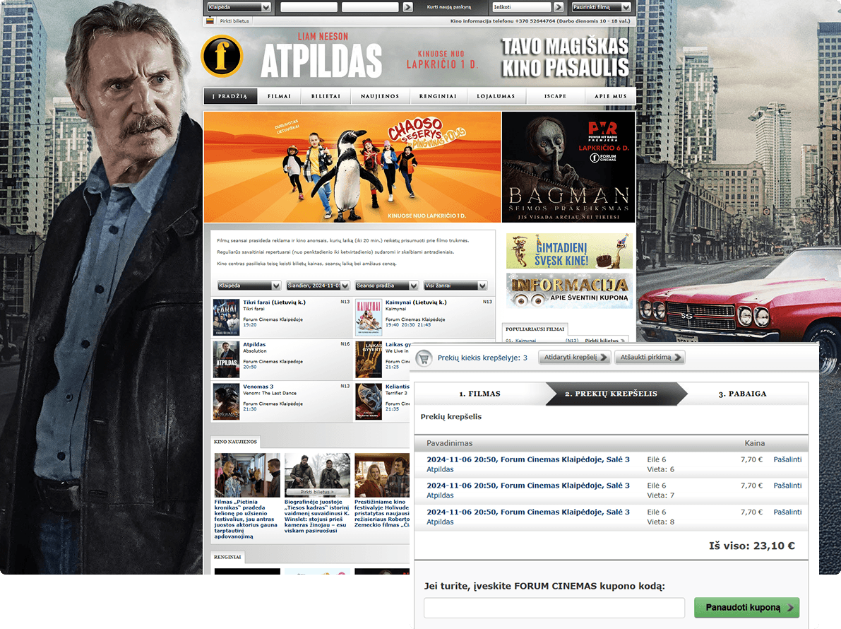
Forum Cinemas, a cinema chain in Lithuania, had a website that was outdated and unintuitive for modern users. After conducting usability testing I identified pain points including:
- •Accessibility issues such as bad contrast
- •Information overload and poorly structured content
- •Checkout process was too long
- •Users have problems finding a trailer or available show times
- •No language switch option
In the middle of my redesign project Forum Cinemas launched a new web design in early 2025. However, upon further Heuristics evaluation it was clear that the website still had usability issues. Few problems that needed addressing included:
- •Poor information display on movie cards
- •Readability issues
- •Checkout process was too long
- •No option to edit number of tickets, seats, etc
- •Poor error prevention and recovery from errors
- •Some contrast issues

The Goal
Redesign the Forum Cinemas website with a modern, user-centered approach — improving usability, visual hierarchy, and whole experience to better serve moviegoers.
My Role
UX/UI Designer — responsible for end-to-end research, UX strategy, journey mapping, wireframes, visual design, responsive layout, and prototype presentation.
Tools Used
My Design Process
Discover
- User Research
- User Interview
- Competitive Analysis
Define
- User Persona
- User Journey Map
- Empathy Map
Ideate
- Brainstorming
- User Flow
Design
- Wireframes
- Visual Design
- Prototype
Test
- Usability Testing
- Survey Insight
- Improvements
1. Research
Conducted competitor analysis of other cinemas in Lithuania and abroad. Conducted online surveys, user interviews and usability testing on the old Forum Cinemas website to understand booking behaviors, frustrations, and overal usage of the site. Developed a key persona: a casual moviegoer. This persona helped me focus on the main points throughout the project.

User persona based on the interview and usability test done on the old Forum Cinema's design (2024)

Empathy map highlighting user thoughts, feelings, and behaviors during the cinema booking experience. Usability test done on the old Forum Cinema's design (2024)
2. Ideation
Mapped the end-to-end journey of the user visiting the site for movie discovery and ticket purchase. Defined core flows: browse and find movies, view schedules and locations, and book/purchase tickets.

User journey map showing the task breakdown and pain/happiness points

Detailed user flow showing the complete movie booking experience
3. Wireframing
Created low-fidelity wireframes for desktop to explore layouts and streamline steps. Focused on reducing friction in finding details about the movie, showtimes and completing bookings quickly.

Low-fidelity wireframes showing key screens in the movie ticket booking process
4. Design System
Built a cohesive design system with typography, spacing, UI components, and color palette (inspired by curent brand colour and cinema aesthetics). Used a dark theme with brand yellow accent to evoke cinematic ambiance and brand recognition. Designed fully responsive High-Fidelity wireframes for desktop and mobile.
Full list of styles and components can be viewed in my Figma files.
Typography
The brand typeface for Forum Cinemas is Oswald - a bold, condensed font that works well for headings due to its strong visual impact. However, it's less suitable for body text, especially at smaller sizes, where readability is essential. To improve clarity and meet WCAG accessibility standards, I introduced Open Sans for body copy and some UI elements. Its open letterforms and balanced spacing ensure excellent readability across all devices.

Typography system with font families, sizes, and usage guidelines
Color Palette
I developed a cinematic color palette based on the brand's yellow accent color, complemented by deep blacks and dark grays to evoke the theater experience. This dark theme creates the perfect backdrop for content while the high-contrast yellow serves as a distinctive accent for important interactive elements and calls-to-action. The palette is WCAG AA compliant, ensuring proper contrast ratios for accessibility.

Extended color system with primary, secondary and accent variations and system colors

Color palette showcasing the dark theme with yellow accent
Components
I designed a comprehensive set of reusable UI components that maintain visual consistency while accommodating various interactive states and contexts. Each component follows accessibility guidelines with proper contrast ratios, focus states, and touch targets. The system includes primary user interface elements such as buttons, input fields, and specialized components like movie cards.

Button components with various states and variants

Input field components with different states and validation

Movie card component with poster, title, important information and interactive states
5. High Fidelity Wireframes and Prototype
Linked all major flows into an interactive Figma prototype. Designed mockups in real device frames to simulate live experience. The high-fidelity wireframes showcase the complete user journey from homepage to successful booking.


Final Result
A cleaner, faster, more enjoyable website experience for moviegoers in Lithuania. Improved navigation structure, more intuitive information display, and better booking flow. Responsive design — mobile and desktop.

Mobile Experience


Access to all Figma files can be provided upon request.
Outcomes & Feedback
To validate my design I used Maze for usability testing with 13 users. The users had to carry a task of booking a movie. Once that was done there were a few questions to further assess their experience.
Key Outcomes
- •Users highlighted the improved booking process
- •Users loved the colour theme
- •Better readability compared with original website.
User testing also provided some insight into areas which further needed improving such as trailer button display and seat numbers. Those changes were implemented in the final high-fidelity designs.
User Feedback
"I would prefer this to be real Forum Cinemas website."
"I was impressed with the design and power of colors, images and modern look."
"I liked it, better readability compared with original website."
Reflection & Learnings
Key Learnings
- Research-first approach helped uncover real frustrations
- Wireframing is an important step in the design process, it helps test and validate ideas before committing to high-fidelity visuals
- Balancing brand personality with usability was key — the redesign feels cinematic yet functional
- Design systems should make collaboration with developers and future scaling far easier
Future Improvements (if I had time)
- Do further interview and usability testing to perfect the seat selection display
- Implementing virtual seat preview
- Integrating food and beverage ordering
- Expanding loyalty program integration
- Finish Hi-Fi designs for all pages
Received 10/10 grade for this project at CodeAcademy
